Building a Financial Management App - Part 6
Implementing Home Screen Design
Web Dev - Nairobi, Kenya
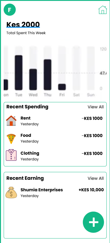
In this step, I implement the home screen to match the design. The design is as follows:
Full Github Code: https://github.com/faithgaiciumia/FinMan-App
The home screen design is implented in three steps:
Implementing the custom header
Implementing the summary div, spendings div, and earnings div
Implementing the floating button
Implementing the Custom Header
The default header only displays the page title. However, the design has a home icon instead of the page title. Therefore, the custom header is to include a home icon. I also centered it, as there was no option to align it on the far-right. To add a custom header, I used the headerTitle option and passed the customHeader component to it. This is in the home page which is the navigation drawer wrapper page (it contains all the page routes for the drawer). In the customHeader component, I added the icon.
Home.js - homePage route
<Drawer.Screen
        name="HomePage"
        component={HomePage}
        options={{
          drawerIcon: ({ color }) => (
            <FontAwesome name="home" size={20} color={color} />
          ),
          headerTitle: (props) => <CustomHeader {...props}/>,
          headerTitleAlign:"center"
        }}
      />
customHeader
function CustomHeader({name}) {
  return (
    <View>
        <AntDesign name="home" size={24} color="black" />
    </View>
  );
}
Now there's a home icon on top of the homepage instead of a text title.
Homepage Divs
The home page has five divs/containers. The summary container, the chart container, the spendings container, and the earnings container. I included a universal 15px margin for all containers. I bundled these divs in a scrollView.
Summary Container
- Styled the texts to match the font-family and the font-size
Chart Container
- Used a chart from
react-native-chart-kit. https://www.npmjs.com/package/react-native-chart-kit
Spendings Container and Earnings Container
These two share the same layout.
For the heading row I used
flexDirectionandjustifyContentto display both texts in a row and on both ends of the screen.For the content rows, I created a component
displayRowand styled the icon image and the texts as expected.
Floating Button
For the floating button, I needed a green button displayed at the bottom of the screen. For it to appear on top of the other content, I placed it outside the scrollview and also gave it a flex value of 0 and a marginBottom. I then added a TouchableOpacity, which is the equivalent of a button wrapper, and an icon (the plus button) inside the touchable opacity. I styled both appropriately giving them a background colour, border radius (for it to be round) and text-color.
The final code on the homepage and the displayRow component is as follows:
HomePage.js
return (
    <View style={styles.container}>
      <ScrollView>
        {/* summary container */}
        <View style={[styles.homeDiv, styles.homeSummary]}>
          <Text style={styles.summHeading}>Kes 2000</Text>
          <Text style={styles.summText}>Total Spent This Week </Text>
        </View>
        {/* end of summary container */}
        {/* chart container */}
        <View style={[styles.homeDiv]}>
          <BarChart
            data={{
              labels: ["January", "February", "March", "April", "May", "June"],
              datasets: [
                {
                  data: [20, 45, 28, 80, 99, 43],
                },
              ],
            }}
            width={Dimensions.get("window").width - 30}
            height={220}
            yAxisLabel={"Rs"}
            chartConfig={{
              backgroundColor: "#1cc910",
              backgroundGradientFrom: "#eff3ff",
              backgroundGradientTo: "#efefef",
              decimalPlaces: 2,
              color: (opacity = 1) => `rgba(0, 0, 0, ${opacity})`,
              style: {
                borderRadius: 16,
              },
            }}
            style={{
              marginVertical: 8,
              borderRadius: 16,
            }}
          />
        </View>
        {/* end of chart container */}
        {/* spending container */}
        <View style={[styles.homeDiv, styles.homeSpending]}>
          {/* header row */}
          <View style={styles.row}>
            <Text style={styles.rowHeading}>Recent Spending</Text>
            <TouchableOpacity>
              <Text style={styles.summText}>View All</Text>
            </TouchableOpacity>
          </View>
          {/* contents row */}
          <View>
            <DisplayRow />
            <DisplayRow />
            <DisplayRow />
          </View>
        </View>
        {/* end of spending container */}
        {/* earning container */}
        <View style={[styles.homeDiv, styles.homeSpending]}>
          {/* header row */}
          <View style={styles.row}>
            <Text style={styles.rowHeading}>Recent Income</Text>
            <TouchableOpacity>
              <Text style={styles.summText}>View All</Text>
            </TouchableOpacity>
          </View>
          {/* contents row */}
          <View>
            <DisplayRow />
            <DisplayRow />
            <DisplayRow />
          </View>
        </View>
        {/* end of earning container      */}
      </ScrollView>
      {/* floating button */}
      <View style={[styles.footer]}>
        <TouchableOpacity style={styles.floatingBtn}>
          <AntDesign name="plus" size={24} color="white" />
        </TouchableOpacity>
      </View>
      {/* end of floating button */}
    </View>
  );
Styling:
const styles = StyleSheet.create({
  container: {
    flex: 1,
    justifyContent: "flex-start",
    alignItems: "flex-start",
    alignContent: "center",
    backgroundColor: "#fff",
  },
  row: {
    flexDirection: "row",
    justifyContent: "center",
    width: Dimensions.get("screen").width,
  },
  homeDiv: {
    margin: 15,
  },
  summHeading: {
    fontSize: 24,
    fontFamily: "PoppinsBold",
  },
  summText: {
    fontSize: 14,
    fontFamily: "Poppins",
  },
  homeSpending: {
    borderColor: "#12B886",
    borderWidth: 1,
    width: Dimensions.get("screen").width - 30,
    padding: 10,
    borderRadius: 8,
  },
  homeEarnings: {
    borderColor: "#12B886",
    borderWidth: 1,
    width: Dimensions.get("screen").width - 30,
    padding: 10,
    borderRadius: 8,
  },
  row: {
    flexDirection: "row",
    justifyContent: "space-between",
    alignItems: "center",
    alignContent: "center",
  },
  rowHeading: {
    fontSize: 20,
    fontFamily: "PoppinsBold",
  },
  footer: {
    flex: 0,
    justifyContent: "flex-end",
    marginBottom: 10,
    height: 10,
    alignContent: "flex-end",
    alignItems: "flex-end",
    marginHorizontal: 10,
    width: Dimensions.get("screen").width - 30,
  },
  floatingBtn: {
    backgroundColor: "#12B886",
    padding: 10,
    borderRadius: 100,
    width: 60,
    height: 60,
    justifyContent: "center",
    alignContent: "center",
    alignItems: "center",
  },
});
DisplayRow.js
import { StyleSheet, Text, View, Image } from "react-native";
import { AntDesign } from "@expo/vector-icons";

export default function DisplayRow() {
  return (
    <View style={styles.row}>
      <View style={styles.col}>
        <Image
          source={{
            uri: "https://img.icons8.com/fluency/512/home-page.png",
          }}
          style={{ width: 40, height: 40, marginRight:10 }}
        />
        <View>
          <Text style={styles.heading}>Rent</Text>
          <Text style={styles.text}>Yesterday</Text>
        </View>
      </View>
      <View>
        <Text style={styles.heading}>-Kes 10,000</Text>
      </View>
    </View>
  );
}

const styles = StyleSheet.create({
  row: {
    flexDirection: "row",
    justifyContent: "space-between",
    alignContent: "center",
    alignItems: "center",
    marginVertical:10
  },
  col: {
    flexDirection: "row",
    alignContent: "center",
    alignItems: "center",
  },
  heading:{
    fontFamily:"PoppinsBold",
    fontSize:15,
  },
  text:{
    fontFamily:"Poppins"
  }
});
Output:
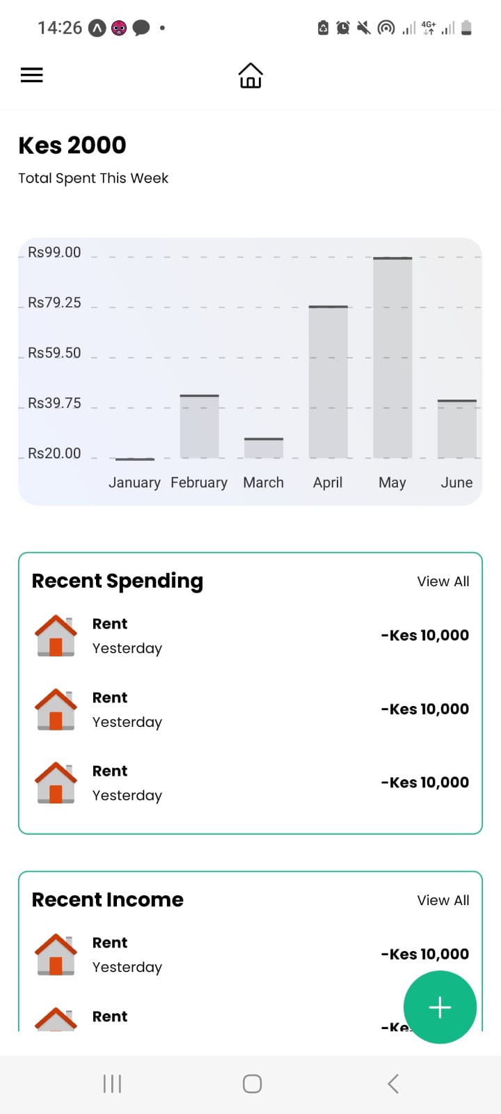
Next is to implement the floating button animation once it is clicked.