Building a Financial Management App with React Native - Part 6
Implementing Home Page Design
Web Dev - Nairobi, Kenya
Full Code: https://github.com/faithgaiciumia/FinMan-App
In my previous post, I created a homepage design. Now I'd like to actualize it and incorporate it into the React Native application.
The home page has two main features that would normally take time to integrate. These are the custom navigation drawer and the custom header. Therefore, I started with those two.
Basic Navigation Drawer
First, I went on to the official documentation page for the React Native Navigation Drawer and followed through with the instructions to implement the simple navigation drawer.
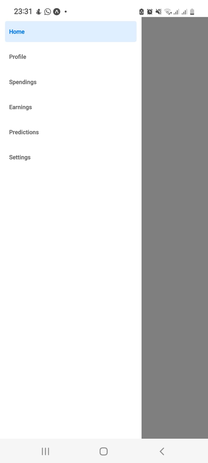
I created the different screens that will be displayed using the drawer. I then added the different screens on the drawer wrapper on the home.js file. The code is as follows:
Home.js
import { createDrawerNavigator } from "@react-navigation/drawer";
import HomePage from "./HomePage";
import Profile from "./Profile";
import Spendings from "./Spendings";
import Earnings from "./Earnings";
import Predictions from "./Predictions";
import Settings from "./Settings";

const Drawer = createDrawerNavigator();

export default function Home() {
  return (
    <Drawer.Navigator initialRouteName="Home">
      <Drawer.Screen name="Home" component={HomePage} />
      <Drawer.Screen name="Profile" component={Profile} />
      <Drawer.Screen name="Spendings" component={Spendings} />
      <Drawer.Screen name="Earnings" component={Earnings} />
      <Drawer.Screen name="Predictions" component={Predictions} />
      <Drawer.Screen name="Settings" component={Settings} />
    </Drawer.Navigator>
  );
}
So far the output is as below:
Now, I add the icons beside the page labels and the custom header showing the user's profile circle and their name 💪
Customising the Navigation Drawer
The first thing is to include the icons alongside the labels - for this, react-navigation gives us the options object where we can specify the drawer icon. I used this to set the icons for each of the screens. The drawer icon receives a prop - colour so that it can inherit the label's colour. I used icons from Expo vector icons as they are easier to integrate; hence, they will look a bit different from what he had on the design. Here is a code snippet for one of the screens:
<Drawer.Screen
        name="Home"
        component={HomePage}
        options={{
          drawerIcon: ({ color }) => (
            <FontAwesome name="home" size={20} color={color} />
          ),
        }}
      />
Output so far:
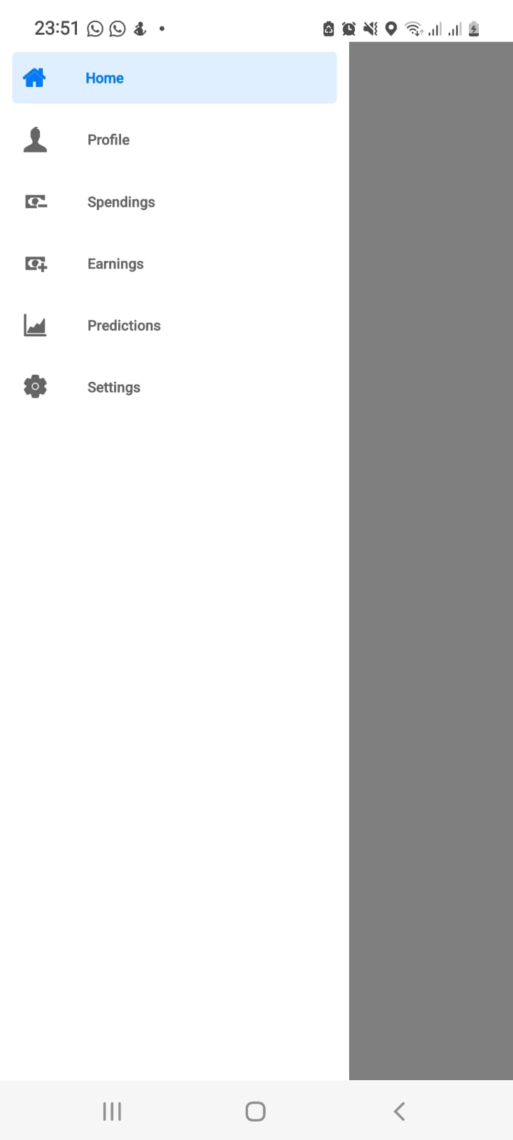
Next up is adding the header.
Adding Custom Header to the Drawer
To add the custom header, I made use of the drawerContent prop. This prop allows us to append custom content to the drawer. A header, footer, or other drawer content can be included in this custom content. The drawerContent automatically receives props from the parent drawer. Props include the drawer routes, colors, and state. Hence, we have to pass these props to the custom drawer content.
So first, I created the custom drawer as a separate component. To avoid creating so many files, I've added it just below the DrawerWrapper code on the Home component. The custom drawer content will automatically override the default drawer content so we have to include the routes list (DrawerItemList) on our own and wrap it within a scrollview (DrawerContentScrollView). Both receive props from the parent drawer as mentioned above. So I'll start with that:
function CustomDrawer(props) {
  return (
    <DrawerContentScrollView {...props}>
      <DrawerItemList {...props} />
    </DrawerContentScrollView>
  );
}
On the Home component, I added the CustomDrawer using the drawerContent prop.
<Drawer.Navigator
      initialRouteName="HomePage"
      drawerContent={(props) => (
        <CustomDrawer {...props}/>
      )}
    >
This will display the routes as a list just as in the default drawer.
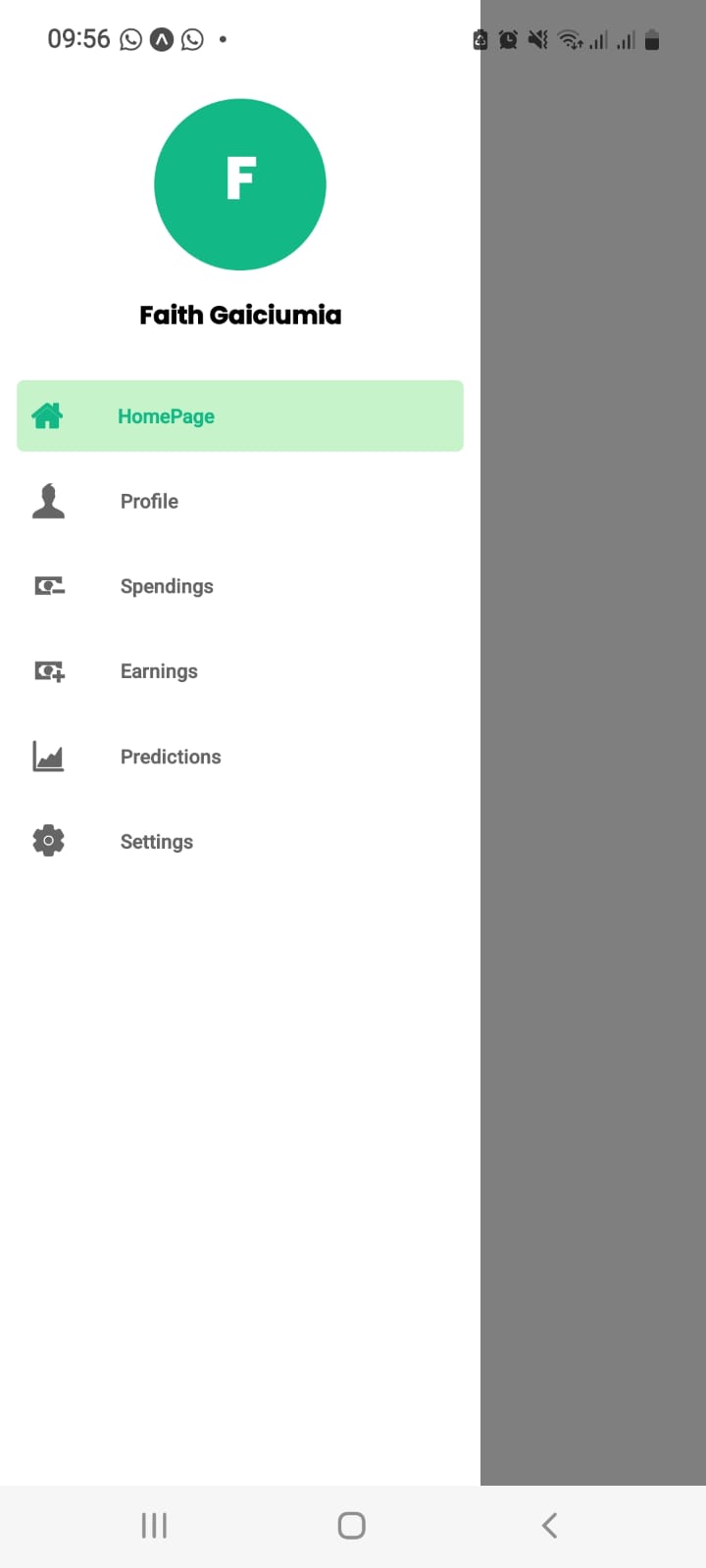
Next on is to add the header just above the DrawerItemList . I added it within a view container and styled it to match what I had in my Figma designs. I added the profile circle, the letter text within it, and the name text below it. However, I got rid of the header background color as it didn't look so good on mobile. Code for the header view:
function CustomDrawer(props) {
  return (
    <DrawerContentScrollView {...props}>
      {/* header */}
      <View style={styles.header}>
        <View style={styles.profileCircle}>
          <Text style={styles.profileText}>F</Text>
        </View>
        <Text style={styles.text}>Faith Gaiciumia</Text>
      </View>
      {/* end of header */}
      <DrawerItemList {...props} />
    </DrawerContentScrollView>
  );
}
The styling:
const styles = StyleSheet.create({
  header:{
    height:180,
    justifyContent:"center",
    alignItems:"center",
    alignContent:"center"
  },
  profileCircle:{
    width:100,
    height:100,
    backgroundColor:"#12B886",
    borderRadius:100,
    justifyContent:"center",
    alignContent:"center",
    alignItems:"center"
  },
  profileText:{
    color:"#fff",
    fontFamily:"PoppinsBold",
    fontSize:42
  },
  text:{
    fontFamily:"PoppinsBold",
    marginTop:15,
    fontSize:18,

  }
})
Also, I needed to change the active bar background color and text color. I did this using the screenOptions prop:
<Drawer.Navigator
      initialRouteName="HomePage"
      drawerContent={(props) => (
        <CustomDrawer {...props}/>
      )}
      screenOptions={{drawerActiveBackgroundColor:"#C6F3CA", drawerActiveTintColor:"#12B886"}}
    >
The final output:
The navigation drawer is done and looking good. Now I move on to the home page contents and the custom header🥳