Building a Financial Management App with React Native - Part 7
Implementing the Home Floating Action Button OnClick


Table of contents
On the design, I have a floating action button at the bottom right of the screen. This button is to enable the user to create/record a new spending or earning. When the button is clicked, it displays both buttons. Each button takes the user to a new page.
Full Github Code: https://github.com/faithgaiciumia/FinMan-App
Expected Design:
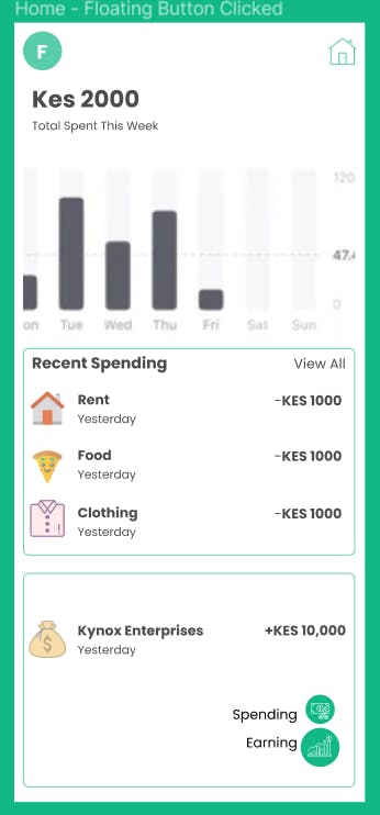
Creating the Modal
The two buttons are displayed in a view which is displayed on top of the other views on the screen. This is a modal. I used the React Native Modal component and tweaked it to fit the needs of my design.
First, I created a view that would house the modal and its contents. I styled the view and gave it flex value of 1 so that it covers the entire screen. I also used flex-end to align the items at the bottom and to the far right. I also added an almost transparent dark background.
bottomView: {
    flex: 1,
    justifyContent: "flex-end",
    alignItems: "flex-end",
    marginVertical: 0,
    backgroundColor: "rgba(0, 0, 0, 0.5)",
  },
Next, I added the two buttons and their respective texts inside the modal. Both buttons and texts were in views that had row styling - to display the text and the button side to side. The modal code:
<View style={styles.bottomView}>
          <Modal
            animationType="slide"
            transparent={true}
            visible={modalVisible}
            onRequestClose={() => {
              setModalVisible(!modalVisible);
            }}
          >
            <TouchableWithoutFeedback onPress={() => setModalVisible(false)}>
              <View style={styles.bottomView}>
                <View style={{ marginVertical: 20 }}>
                  <View style={styles.modalRow}>
                    <Text style={styles.modalText}>Spending</Text>
                    <TouchableOpacity
                      style={[styles.floatingBtn, styles.spendingBtn]}
                      onPress={() => {
                        setModalVisible(false);
                        navigation.navigate("AddSpending");
                      }}
                    >
                      <MaterialCommunityIcons
                        name="cash-minus"
                        size={20}
                        color="white"
                      />
                    </TouchableOpacity>
                  </View>
                  <View style={styles.modalRow}>
                    <Text style={styles.modalText}>Earning</Text>
                    <TouchableOpacity
                      style={[styles.floatingBtn, styles.earningBtn]}
                      onPress={() => {
                        setModalVisible(false);
                        navigation.navigate("AddEarning");
                      }}
                    >
                      <MaterialCommunityIcons
                        name="cash-plus"
                        size={20}
                        color="white"
                      />
                    </TouchableOpacity>
                  </View>
                </View>
              </View>
            </TouchableWithoutFeedback>
          </Modal>
        </View>
In the above code, I specify different attributes for the modal. These include the animation type, transparent - if the modal gets to show the other views or completely cover them, the onRequestClose - this is the response from the modal if the user presses on their back button or any other element supposed to close the modal, and the visible prop - a boolean value which toggles the modal's visibility. The variable modalVisible is declared as a state const and keeps changing whenever the modal is closed or opened.
const [modalVisible, setModalVisible] = React.useState(false);
The modal contents are also wrapped within a TouchableWithoutFeedback which when clicked sets modalVisible to false hence closing the modal. The TouchableWithoutFeedback is a clickable which returns no visual feedback when clicked. This component will enable the user to close the modal whenever they click outside the two buttons. (The user does not have to press the hardware back button to close the modal).
Lastly, both buttons have an onPress event which implements two functions:
It sets the
modalVisibleto falseNavigates the user to the respective add new earning/spending pages
The floating action button has the code to set modalVisible to !modalVisible - the opposite of the current value of modalVisible, hence opening/closing the modal. However, for this case it just opens. Also, this button is conditionally rendered - it only shows when modalVisible is false. This is so that once the modal is open this button is hidden - preventing it from distracting the user.
{!modalVisible && (
          <TouchableOpacity
            style={styles.floatingBtn}
            onPress={() => setModalVisible(!modalVisible)}
          >
            <AntDesign name="plus" size={24} color="white" />
          </TouchableOpacity>
        )}
Now the output:
In this section I did not include the entire page's code as it is mixed with other features.
Next on is to design the drawer pages and implement them.